Technical & Experience Audits
UI/UX Audit
Key usability gaps and experience improvement areas.
Context
WAYN aims to be the UAE’s digital P.O. Box - a secure, unified platform for managing official communications between individuals, businesses, and government entities. Its value depends on trust, clarity, and efficiency.
This assessment covers five core areas of the current experience:
Dashboard
My Inbox
Message View
Documents
Address Book (Digital P.O. Box)
It highlights strengths, usability gaps, and design opportunities grounded in practical UI/UX principles.
Executive Summary
WAYN has a clean, consistent base. Where it falls short is experience continuity: modules are clear on their own but don’t connect into a single flow. The dashboard leans on marketing-style KPIs that don’t reflect official communications. Inbox and Documents don’t talk to each other enough. The Address Book should act as the identity/address layer of a digital mailbox - not a contacts utility.
What to shift:
Cohesion - Link Inbox ↔ Documents ↔ Address identities so users never lose context.
Clarity - Replace vanity metrics with actionable, compliance-oriented insights.
Confidence - Make trust visible (encryption, verified entities), add bilingual support, and give clear feedback on actions.
Key Findings Summary
Category | Current Strength | Primary Issue | UX Principle | High-Impact Opportunity |
|---|---|---|---|---|
Dashboard | Clean cards, clear grouping | Metrics misaligned with “digital P.O. Box” | Relevance Heuristic | Surface “Unread Official Notices”, “Pending Signatures”, “Deadlines”, “Recent Verified Senders” |
Inbox | Familiar list, useful filters | No preview, no urgency, weak doc linkage | Cognitive Load Theory, Hick’s Law | Split view with preview, urgency chips, inline doc actions, bulk operations |
Message View | Strong reading layout | No action toolbar, external links break flow, no translation | Visibility of System Status, Context Preservation | Add toolbar (Done/Archive/Reply), internal doc viewer, translation toggle |
Documents | Structured table, sortable | Hidden actions, no preview, generic categories | Affordance, Recognition over Recall | Visible row actions, preview modal, smart foldering, back-link to source message |
Address Book (Digital P.O. Box) | Clear cards, “Add New” entry | Treated like contacts, not addresses; no verified status; weak linkage | Consistency & Standards, Findability | Make it the address/identity layer: verified status, address types, search/tags, deep linkage across Inbox/Docs |
Cross-Module UX | Consistent typography/layout | Siloed journey, little guidance | Continuity, Progressive Disclosure | Global search, context chips, onboarding tips, inline guidance and tooltips |
Overall Assessment
WAYN’s interface is clean and functional, with consistent typography and clear sectioning. But the current emphasis on campaign metrics and siloed tabs doesn’t yet reflect the core promise of a secure digital mailbox. Users need a single narrative: messages arrive from verified entities, contain documents, and resolve into actions — without jumping between separate areas.
Overall strengths
Simple tabbed navigation across core modules.
Readable type scale, balanced white space (Cognitive Load Theory).
Inbox/Documents include base filters and sorting (good Findability).
Overall issues
Weak cross-linking between Inbox, Documents, and Address identity layer (Continuity).
Dashboard KPIs focus on email marketing, not compliance or tasks (Relevance Heuristic).
Minimal onboarding or contextual guidance (Recognition over Recall).
Trust/value (encryption, verified senders) isn’t surfaced early.
Overall recommendations
Redesign the Dashboard to surface actionable notifications (pending documents, upcoming deadlines, unread official notices).
Integrate modules: open related documents from a message inline; link senders to their address identity entry.
Provide a global search across messages, documents, and addresses.
Add onboarding tips, contextual help, and trust cues (verified badges, encryption notes).
1) Dashboard
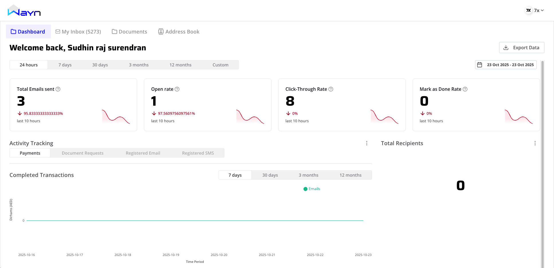
What’s good
Clear card layout with simple trend mini-sparklines (helps scanning).
Time-range filters (24h, 7d, 30d, 3m, 12m) enable quick pivots.
White space keeps things breathable (Cognitive Load Theory).
Gaps
Misaligned metrics: “Open Rate,” “CTR,” “Mark as Done Rate” reflect campaign behavior, not official comms.
Ambiguous values: mixed counts and long decimals (e.g.,
97.560975…) without context clutter the signal.Static cards: no drill-downs or “next action” affordances (Fitts’s Law).
Trust messaging absent: no visible encryption/verification cues.
High-impact recommendations
Replace cards with task & compliance insights:
Unread Official Notices, Documents Awaiting Signature, Upcoming Deadlines, Entities Contacted You (last 7 days).
Make every card clickable → opens filtered view (Inbox/Docs).
Add short helper text/tooltips under each metric (Progressive Disclosure).
Add a Trust Panel: “Encrypted in transit at X,” “Y verified entities,” last successful UAE PASS auth time.
Dashboard summary table
Aspect | Observed positives | Issues/gaps | UX Principle | Key opportunities |
|---|---|---|---|---|
Metrics | Glanceable cards | Not relevant to mailroom tasks | Relevance Heuristic | Compliance/task KPIs |
Filters | Helpful time ranges | No entity/type context | Progressive Disclosure | Add entity/type filters |
Interactions | Clean layout | Cards not interactive | Fitts’s Law | Click-through to filtered lists |
Trust | – | No visible security cues | Aesthetic–Usability, Visibility of Status | Trust panel (encryption, verified counts) |
2) My Inbox
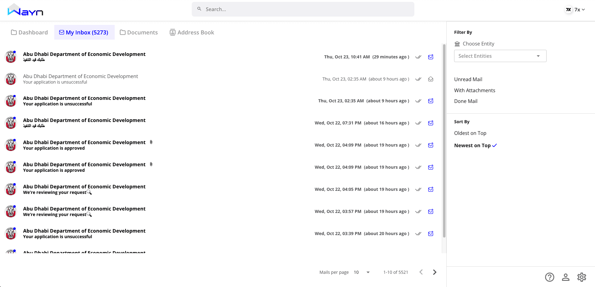
What’s good
Familiar email-style list: sender, subject, timestamp (Jakob’s Law).
Filter panel (entity, unread, attachments, done) and sort toggle are clear.
Prominent search bar (good Findability).
Gaps
Siloed flow: attachments push users to the Documents tab (context switch).
No preview: forces a full page jump to read; scanning becomes slow (Fitts’s Law).
No urgency: all items look equal; hard to prioritize (Pre-attentive Processing).
No bulk actions despite 5k+ messages (Hick’s Law).
High-impact recommendations
Split view: left list + right preview; show message body and attachments inline.
Urgency/type chips: “Requires Action,” “Official Notice,” “Invoice,” “FYI.”
Inline document icons with one-click preview/download.
Bulk operations: select, mark done, archive, move.
Context chips linking to Address identity (sender), related Documents, and past threads (Continuity).
My Inbox summary table
Aspect | Observed positives | Issues/gaps | UX Principle | Key opportunities |
|---|---|---|---|---|
List & layout | Clear hierarchy | No preview; overwhelming volume | Fitts’s Law, Hick’s Law | Split-view, grouping, urgency |
Filters & sort | Entity/status filters | Not shared across modules | Continuity | Cross-module linked filters |
Actions | Per-item icons | No bulk, no inline doc actions | Affordance | Bulk ops, inline previews |
3) Message View (Detailed Mail View)
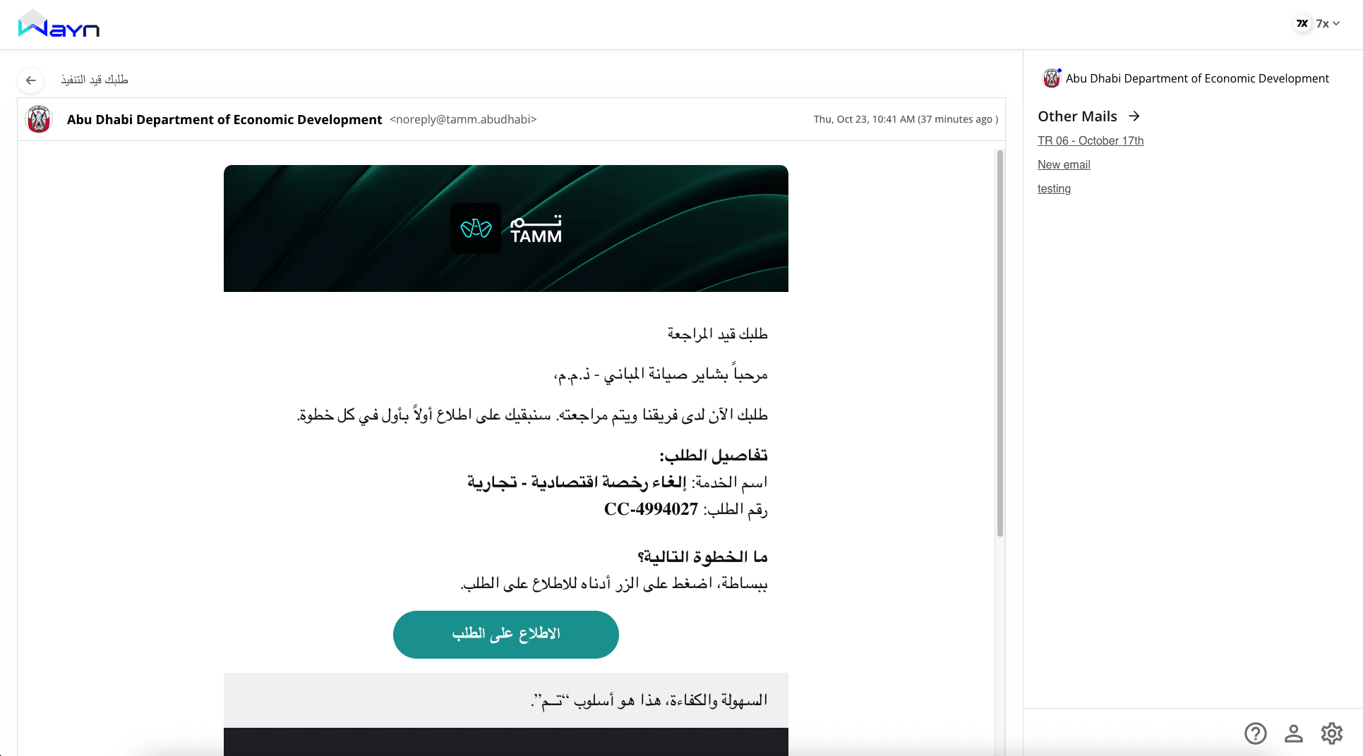
What’s good
Focused reading area; long-form content renders cleanly.
Right panel lists “Other Mails” from same sender (good context anchor).
Gaps
Isolated workflow: no toolbar for Done/Archive/Reply/Forward; users backtrack to act.
External CTAs: “View Request” opens outside WAYN instead of an internal doc viewer (Context Preservation).
Language accessibility: many messages are Arabic; no translation toggle.
Side panel underused: valuable real estate with little metadata.
High-impact recommendations
Add a message toolbar: Mark Done, Archive, Reply, Forward.
Open documents internally: clicking the CTA routes to the WAYN document preview with provenance.
Translate toggle (Arabic ↔ English) while preserving original (Accessibility).
Enrich right panel with sender identity (Address entry), verified badge, and related documents.
Message View summary table
Aspect | Observed positives | Issues/gaps | UX Principle | Key opportunities |
|---|---|---|---|---|
Reading experience | Strong hierarchy | No immediate actions | Visibility of Status | Toolbar with core actions |
Continuity | Related mails panel | External doc links | Context Preservation | Internal doc viewer |
Accessibility | Arabic content supported | No translation toggle | Accessibility | Inline translate |
Metadata | – | Side panel thin | Information Scent | Show sender identity + related docs |
4) Documents
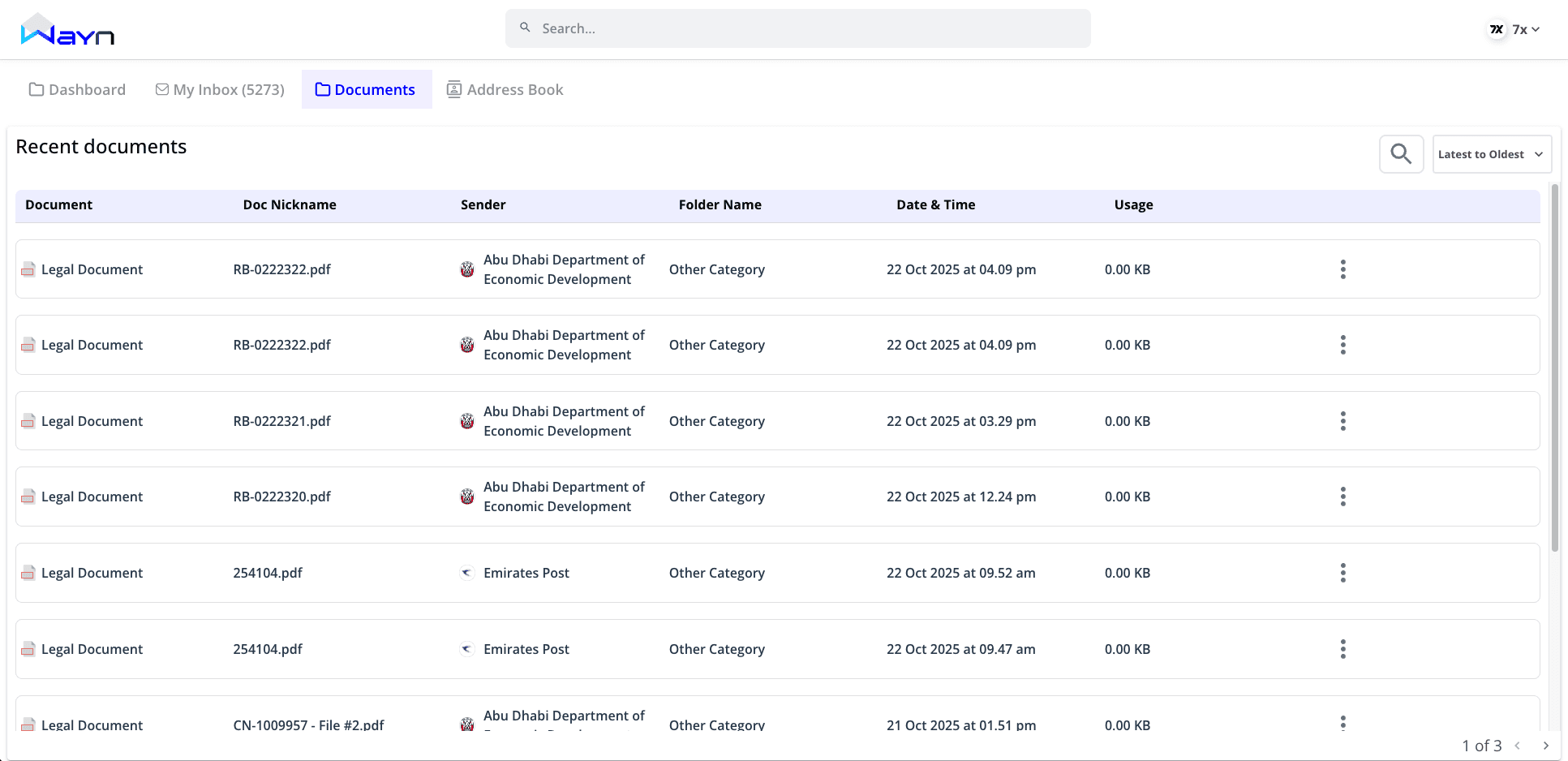
What’s good
Structured, sortable table; pagination avoids overload.
Columns (nickname, sender, date, usage) aid scanning (Gestalt – Alignment).
Gaps
Hidden actions behind kebab menu (discoverability issue) (Affordance).
No quick preview; users bounce into a new view.
Generic foldering (everything “Other Category”) → weak information scent.
No source context: which message delivered this file?
High-impact recommendations
Make primary actions visible per row (View, Sign, Download).
Add preview modal with doc metadata (sender, received date, source message link).
Smart foldering: default groups (Government Letters, Invoices, Licenses, Contracts).
Back-link to the originating message and forward-link to the sender’s Address entry (Continuity).
Documents summary table
Aspect | Observed positives | Issues/gaps | UX Principle | Key opportunities |
|---|---|---|---|---|
Table structure | Clear columns | Actions hidden | Affordance | Visible primary actions |
Preview | – | No quick glance | Recognition over Recall | Modal preview with metadata |
Organization | Folder column exists | Generic categories | Information Scent | Smart, typed folders |
Context | – | No origin linkage | Continuity | Link to source message + address |
5) Address Book
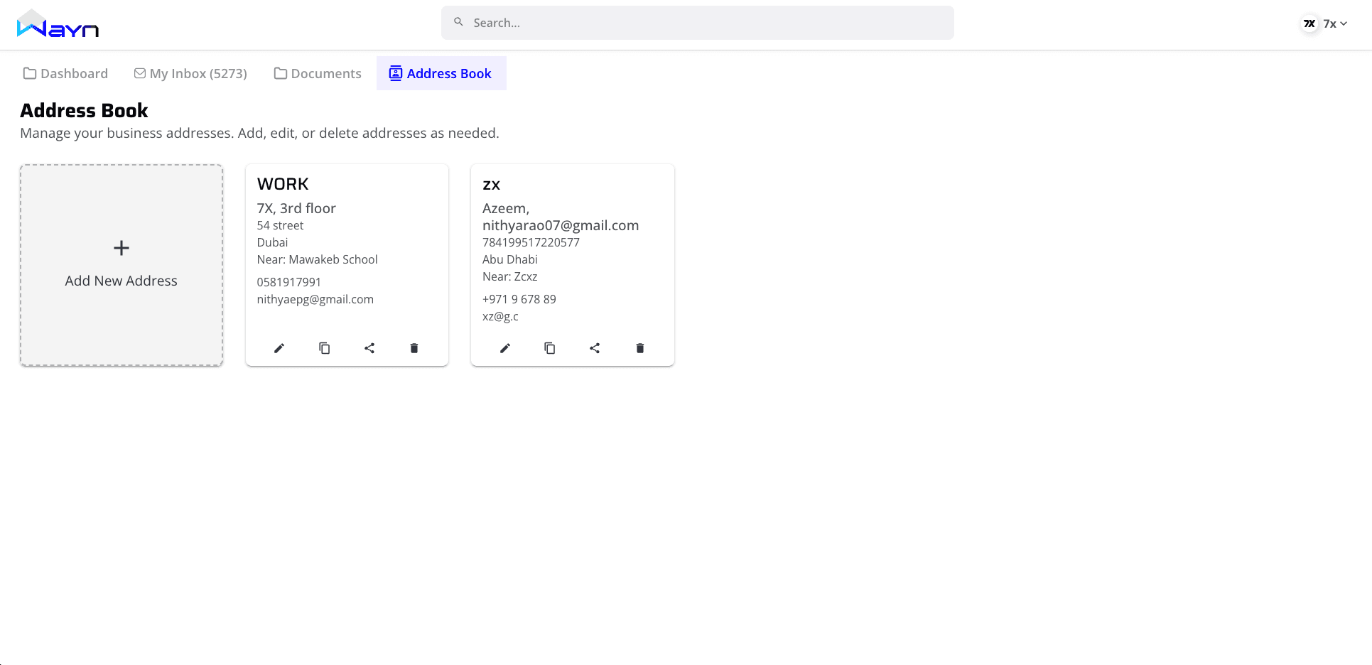
What’s good
Card layout is simple and scannable.
“Add New Address” tile gives a clear action entry.
Gaps
Wrong mental model: treated like contacts; should be addresses/identities tied to Inbox and Documents.
No verified indicators for official/government addresses.
No address type (Corporate / Federal Decree / Local Decree / Delegate).
No search/tags to quickly locate an address in large registries (Findability).
No linkage to messages and documents tied to that address (Continuity).
High-impact recommendations
Promote this module to Address Identity:
Show address string (e.g.,
IssueEntity+TradeLicenseID@wayn.ae), entity name, logo, verification badge, address type.Display recent messages/documents received at this address (mini activity).
One-click “Open Inbox for this Address” and “Show Documents from this Address.”
Add search, filters, and tags: address type, verified/unverified, entity category.
Let users pin important addresses to the dashboard (reduces time to critical info) (Fitts’s Law).
Make “Add New Address” a guided flow: validate format, verify entity, set type, optional nickname (Progressive Disclosure).
Address Identity summary table
Aspect | Observed positives | Issues/gaps | UX Principle | Key opportunities |
|---|---|---|---|---|
Model | Clean cards | Treated as contacts, not addresses | Consistency & Standards | Elevate to address/identity layer |
Trust | – | No verification status | Aesthetic–Usability, Visibility of Status | Verified badges, address type |
Findability | Clear “Add New” | No search/tags | Findability | Search, filters, tagging |
Continuity | – | Not linked to Inbox/Docs | Continuity | Open inbox/docs scoped by address |
Onboarding | – | Raw add flow | Progressive Disclosure | Guided add + validation |
Cross-Module Experience Principles
Single Source of Context: Every message should link to its document(s) and address identity; every document should link back to source message and address. (Continuity)
Global Search: Search across messages, documents, addresses, with scoped results and recent filters. (Findability)
Trust Visibility: Show verified entity badges and encryption status near sender and in the address identity. (Visibility of System Status)
Guided First-Run: Short, contextual pointers for first-time users - “Here’s how to triage your inbox,” “This is your address identity.” (Progressive Disclosure)
Consistent Actions: Done/Archive/Reply appear in list, preview, and detail - always in the same place. (Consistency & Standards)
Final Thoughts
WAYN has the right bones - clean UI, clear structure, and the right ambition. Turning it into a platform people rely on daily means connecting the dots:
A task-first Dashboard for official comms.
An Inbox that previews, prioritizes, and routes to action.
A Message View with built-in actions, translation, and internal document viewing.
A Documents area that’s contextual and decisive.
An Address Identity layer that anchors trust and continuity across the product.